2 more websites reviewed: Carol Pitts and Tom Dempster
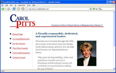
 I don't know what it is with this website. It's graphically pleasing, and has information at your fingertips about Carol. But for lack of a better word, it seems a bit "sterile."
Now, that's not meant as a harsh criticism but more of a verbalized request for what I'd like to see. I see all the text I could read about her, but there's nothing that makes an emotional connection for me. If I were to change one thing about this website, I'd add some pictures.
I have friends who speak very highly of Carol, and my problem is that I've got one picture to go by. I want some visual stimulation showing her talking and listening. I want to see her emote. One picture is not enough on a web page. It's a visual medium, so where it says Carol's family, lets see a picture of them. She was in the military and the legislature - let's see some pictures of it.
Bottom line: Add some pictures, and it will be perfect. Go check it out at http://www.carolpitts2006.com.

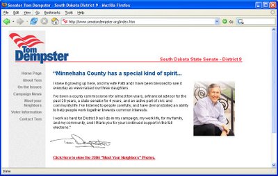
Tom Dempster's website is done by the same person who does Carol's. Aside from noting that this web developer likes white backgrounds and left navigation links, here they do it much better with a few more photos. There could be more per page, but the photo tour was engaging and makes up for it.
Tom lays out his plaform, and there's links to news articles. Plenty for a voter wanting to find out about him, and the site is done very well.
Go check out Tom's website at http://www.senatordempster.org.
Comments
I promise, the next political page won't have a white background. (Unless, the customer wants one.) And we'll work on getting more pictures for Carol's site.
I figured you would:)
It's "Support SoDak Medical Marijuana."