Campaign Lit 101:Nancy Turbak for Senate.
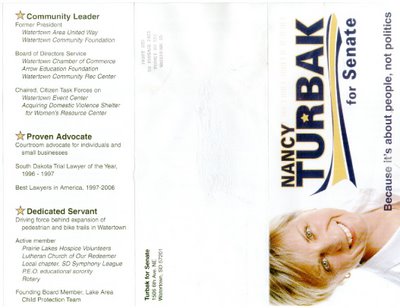
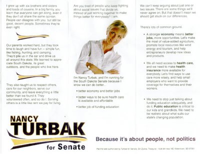
I'm looking at Nancy Turbak's brochure which apparently went out in the mail in the past few days. And I want to find the photographer for these pictures and whoever came up with the concept for this brochure. And I want to stop them before they ever do this to a candidate ever again.
Why? Instead of her candidacy being highlighted, the only thing I can think about is "her head flopping around" because the pictures give the impression that she doesn't have the use of her neck muscles.

You look at one, and her head is flopped one way. You look at the other and... Oops. There must have been a breeze, because it's flopped the other way.

You know, everything I hear is that Nancy is one of, if not the best trial lawyer in the state and extremely intelligent. Does this brochure convey that? No.
Actually, I have to admit that for a while there, I was thinking she's going to be a tough candidate. It's what I heard from many a Republican. But with this dreck passing as her campaign lit, I think it was unfounded fear.
And you know what the worst thing is? You know what came to mind when I first saw it?
 It looks like a promotional piece for Ellen DeGeneres' talk show.
Think I'm kidding? Check out the photo at the left. White shirt, short, blonde hair. For god's sake, they even sort of look alike.
Now, I'm not saying things need to be red, white and blue or anything specific. But this cocked head, open white collared shirt thing they have going just doesn't work.
Does this brochure make her look like one of the most highly regarded legal minds in South Dakota? No. It makes her look like Ellen.
What would I do to fix this? Gather each and every copy. Burn them, and hope too many people haven't seen it. And then fire the ad agency who came up with it. And then whatever they do next - just don't do this.
And stay tuned. Because her next guest will be Owen Wilson....
Why? Instead of her candidacy being highlighted, the only thing I can think about is "her head flopping around" because the pictures give the impression that she doesn't have the use of her neck muscles.

You look at one, and her head is flopped one way. You look at the other and... Oops. There must have been a breeze, because it's flopped the other way.

You know, everything I hear is that Nancy is one of, if not the best trial lawyer in the state and extremely intelligent. Does this brochure convey that? No.
Actually, I have to admit that for a while there, I was thinking she's going to be a tough candidate. It's what I heard from many a Republican. But with this dreck passing as her campaign lit, I think it was unfounded fear.
And you know what the worst thing is? You know what came to mind when I first saw it?
 It looks like a promotional piece for Ellen DeGeneres' talk show.
Think I'm kidding? Check out the photo at the left. White shirt, short, blonde hair. For god's sake, they even sort of look alike.
Now, I'm not saying things need to be red, white and blue or anything specific. But this cocked head, open white collared shirt thing they have going just doesn't work.
Does this brochure make her look like one of the most highly regarded legal minds in South Dakota? No. It makes her look like Ellen.
What would I do to fix this? Gather each and every copy. Burn them, and hope too many people haven't seen it. And then fire the ad agency who came up with it. And then whatever they do next - just don't do this.
And stay tuned. Because her next guest will be Owen Wilson....
Comments
People will forgive her floppy neck. But will they read that much text?
I've said it before, and will continue to say so - don't bring that kind of stuff up here.
This post is solely based on the fact her brochure looks like an ad for Ellen's talk show, made all the worse by her strong resemblance.
In other words, someone thought it would be good to possibly soften her image. And it was not to her credit.
And that's it.
And Dave Novstup gives off a kind of aging Harry Potter vibe.
So what?
I hope Turbak wins.
Anon 1:19, why do you hope she wins? (Other than because she is you?) Maybe it's because she had "loads of cousins." That's important. It's good to know that her loads taught her that "People can disagree with you, but still be good, decent people." That makes me feel happy.
Then she talks about respecting others, and that is also nice.
And then in columns two and three, she starts to reveal her stripes. Turns out her respect for people stops at the doorstep of the Capitol. Apparently those people are not allowed to disagree on the issues and still be eligible for "good, decent people" status. Because Nancy is "tired" of them and the work they do.
After that, she speaks the code words that tell us she's probably strongly pro-abortion and pro-gay marriage. She doesn't want to focus on "the (one or two) social issues that divide us" and of course we all know that if Nancy Turbak gets elected, all of a sudden those issues will no longer be introduced during the legislative session. It's a good thing, too, because if she is "tired" of watching them from afar, she'd be apt to go into hibernation when in the midst of the tough issues.
Speaking of that, Ho-Hum. I'm "tired" of looking at another thinly disguised liberal campaign piece in which a candidate tries to spread discontent. She needs to "stop just talking about" it, and....fade away.
We want people to represent what we care about it, not to go to Pierre and hang out at the MENSA club all day.
Hell, I don't want know it all legislators. It makes them more willing to keep their pulse on the people than on some liberal elitist know it all crap that Turbak buys into.
Your politcal bias is obvious in this post. Let's review your post on May 31st regarding Katy Dressen's websit. You call it "graphically appealing". If you all check out this Republican House Candidate's websit, www.katydressen.com, you will all notice the head tilt shots. Her head is way more tilted then Turbak's. I also don't get your knock of her open collared shirt. The only thing covering Katy's neck is a pretty little necklace. Both have the same feel graphically. What gives?
You don't like her hair? You have just insulted a large share of females in South Dakota. Step away from your computer and head to the Mall. The short look is in.
PP you simply don't like her or her lit because she is a Democrat.
By the way both Katy and Miss Ellie's heads are "cocked" on your scrolling header. Maybe you should have them send some new pictures.
What have you been smokin'?
"both Katy and Miss Ellie's heads are "cocked" on your scrolling header."
Maybe you are tilting your head? "Cocked?" Not on my computer screen.
PP- You missed the crossed arms--body language that says "don't dig too deep I have some secrets that I would rather you not know about."
It seems to work for both of them.
And now you find yourself deleted.
Unless you would say it in a newspaper or to a reporter under your own name, don't say it here.