Ogres are like Photoshop. They have many layers
When I do campaign photography, it's not an exaggeration when I say I that for every 100 photos I take, I might find six or seven that I like. If there aren't any, or one that's just on the cusp of being good, I sometimes have to make my own.
What tools should you use for high end photo editing? You could spend $559 on Adobe Photoshop CS2. Or you could get Photoshop Elements (about $59 at Amazon.com). My choice? Paint Shop Pro, which should give you all the layering tools that allow you to perform these easy edits in a $89 package with just about everything that the full version of Photoshop has.
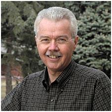
Anyway, for our example, what I envisioned is that I needed to find a decent campaign photo and make it better. So, after going on the hunt, I found the perfect example in this campaign photo from Attorney General Larry Long's 2004 campaign. (Now, don't take this as my saying I don't like the photo. I would be happy to use it in any campaign material as is.)
 This photo is good - really good - utilizing the more modern style of campaign photography that we seem to be moving towards. I prefer this kind of photo. It's much more personal, and it gets away from the "school photo" style for a more natural surrounding. (Even schools are getting away from those photos).
If I was to tinker with it, there's not much I'd do, with the exception of two things.
#1 - the background is a little busy, and draws your attention away from the candidate, who should be the sole focus of the photo. He's the one we want to elect. Not the tree.
#2 - I think there's too little contrast between the dark green shirt, and the dark green background. We want to feature the candidate, so we want him to boldly stand out.
Fortunately, the fixes for this are really quick and easy. For both fixes, we need to work with photo layers.
So what are photo layers? Consider a photo layer a sheet of clear acetate that goes over an existing photo to mask or highlight parts of it. That's the form they took before the computer age - there actually was a sheet of acetate that went over photos to mask stray hairs, moles, etc.
Back when I was with the SDGOP, and Governor Mickelson was running, someone came in one day with a photo of him for a campaign piece. And there was a mask over the photo that took care of stray hairs from the photo, making for a nice polished look.
So, we're going to be working in the modern electronic equivalent.
First, we need to duplicate the original photo into it's own separate layer. We then erase the background, leaving the candidate's head and shoulders, and everything else is transparent. Once this is done, lock this layer so we don't inadvertently ruin it.
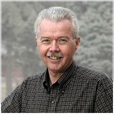
Go back to the other photo that we haven't messed with. Now, to fix problem #1, we're going to apply a blur effect to the extent it is no longer crisp and clear. We want it a little blurry, so features are washed out.
To fix problem #2, we're going to make the photo lighter, so the color starts to fade - just a little washed out. This is going to improve the contrast between the first layer and the second layer.
Now, drop the first photo where we just erased the background back over the top of the blurred photo.

You'll see that our AG appears separately as a foreground layer. There's improved contrast between the Attorney General and his background, and your eyes are focused directly on him - you aren't even concerned with what's going on behind him. He's now the sole focus of the photo. Yet, it still maintains the authentic outdoor effect that much of the new campaign photography utilizes.
If I was going to do this for real, I'd play with the background a little more. In this example it's probably too close to his hair color, and I'd go just a smidgen darker. But it's really, really close at this point. It looks professional quality. And it literally didn't cost us a dime.
When you are working on a shoestring campaign budget, and doing all of your own photography, a little electronic editing can pay big dividends, and help you look like you're paying a pro to do the work.
Just to point it out, I had a nice note today in my e-mail box from Brendan Johnson himself. Coincidentally, today I also had a friend relay that he was noticing Mark Mickelson is on the Minnehaha GOP Exec Board. Between those guys being eyed for an election sometime soon, and Congresswoman Herseth winning in 2004, I'm starting to feel old. I did a good post on the next generation a while back, and clearly, we're going to see more and more of them.
As for me? I'm pathetically worn out and old at 38. I better pick up some grecian formula at Wal Mart next time I go.
What tools should you use for high end photo editing? You could spend $559 on Adobe Photoshop CS2. Or you could get Photoshop Elements (about $59 at Amazon.com). My choice? Paint Shop Pro, which should give you all the layering tools that allow you to perform these easy edits in a $89 package with just about everything that the full version of Photoshop has.
Anyway, for our example, what I envisioned is that I needed to find a decent campaign photo and make it better. So, after going on the hunt, I found the perfect example in this campaign photo from Attorney General Larry Long's 2004 campaign. (Now, don't take this as my saying I don't like the photo. I would be happy to use it in any campaign material as is.)
 This photo is good - really good - utilizing the more modern style of campaign photography that we seem to be moving towards. I prefer this kind of photo. It's much more personal, and it gets away from the "school photo" style for a more natural surrounding. (Even schools are getting away from those photos).
If I was to tinker with it, there's not much I'd do, with the exception of two things.
#1 - the background is a little busy, and draws your attention away from the candidate, who should be the sole focus of the photo. He's the one we want to elect. Not the tree.
#2 - I think there's too little contrast between the dark green shirt, and the dark green background. We want to feature the candidate, so we want him to boldly stand out.
Fortunately, the fixes for this are really quick and easy. For both fixes, we need to work with photo layers.
So what are photo layers? Consider a photo layer a sheet of clear acetate that goes over an existing photo to mask or highlight parts of it. That's the form they took before the computer age - there actually was a sheet of acetate that went over photos to mask stray hairs, moles, etc.
Back when I was with the SDGOP, and Governor Mickelson was running, someone came in one day with a photo of him for a campaign piece. And there was a mask over the photo that took care of stray hairs from the photo, making for a nice polished look.
So, we're going to be working in the modern electronic equivalent.
First, we need to duplicate the original photo into it's own separate layer. We then erase the background, leaving the candidate's head and shoulders, and everything else is transparent. Once this is done, lock this layer so we don't inadvertently ruin it.
Go back to the other photo that we haven't messed with. Now, to fix problem #1, we're going to apply a blur effect to the extent it is no longer crisp and clear. We want it a little blurry, so features are washed out.
To fix problem #2, we're going to make the photo lighter, so the color starts to fade - just a little washed out. This is going to improve the contrast between the first layer and the second layer.
Now, drop the first photo where we just erased the background back over the top of the blurred photo.

You'll see that our AG appears separately as a foreground layer. There's improved contrast between the Attorney General and his background, and your eyes are focused directly on him - you aren't even concerned with what's going on behind him. He's now the sole focus of the photo. Yet, it still maintains the authentic outdoor effect that much of the new campaign photography utilizes.
If I was going to do this for real, I'd play with the background a little more. In this example it's probably too close to his hair color, and I'd go just a smidgen darker. But it's really, really close at this point. It looks professional quality. And it literally didn't cost us a dime.
When you are working on a shoestring campaign budget, and doing all of your own photography, a little electronic editing can pay big dividends, and help you look like you're paying a pro to do the work.
Just to point it out, I had a nice note today in my e-mail box from Brendan Johnson himself. Coincidentally, today I also had a friend relay that he was noticing Mark Mickelson is on the Minnehaha GOP Exec Board. Between those guys being eyed for an election sometime soon, and Congresswoman Herseth winning in 2004, I'm starting to feel old. I did a good post on the next generation a while back, and clearly, we're going to see more and more of them.
As for me? I'm pathetically worn out and old at 38. I better pick up some grecian formula at Wal Mart next time I go.
Comments
"If I was going to do this for real, I'd play with the background a little more. In this example it's probably too close to his hair color, and I'd go just a smidgen darker."
The point is that the background should not be the focus at all. If you're looking at the trees, then they should be blurred up.