Campaign Lit 101: Chris Nelson for Secretary of State
I've got my hands on a piece or two of campaign literature for 2006, so this is a great time to start a new feature on the SDWC - Campaign Literature 101, where I feature and talk about the literature for various candidates for public office.
In all of this, it's simply my own opinion and nothing more. It's not meant to pick on anyone. I might just point out what I'd do differently. Don't agree? That's your right. Last election I disliked Dusty Johnson's choice of orange as a campaign color. He ignored me, and rode the orange wave to victory, since it stood out from the pack. What can I say? I'm a traditionalist, so I tend to look at things in those terms.
Anyway, the first piece of campaign literature up for 2006 up for review? Secretary of State Chris Nelson.
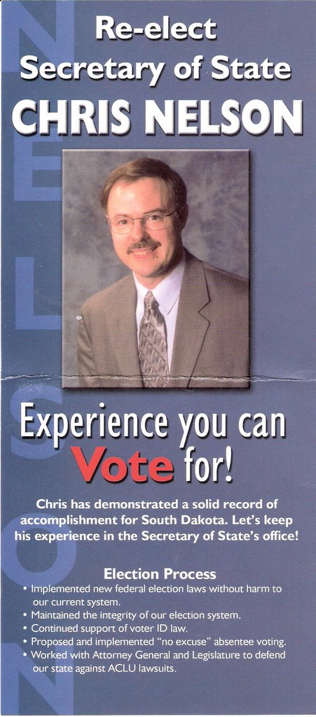
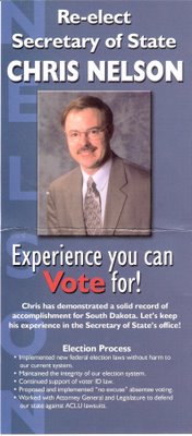 This is an exceptionally good looking piece of campaign literature. I like the colors. Plus full color 2 sided slick paper - this was not cheap, nor is it "insty-print" quality. The design is also attractive. I'd imitate this campaign card in a second.
On the front, if it had anything I would call a deficiency, my personal preference would be to have the name and office stand out more, and Vote to stand out less. At the very least, name and office could have been in red as well. But then again, I might have looked at it the other way and left it like this.
I might have also preferred a picture with a dark suit for that background, but absent that, it does draw the focus on his face, which may have been in the intent.
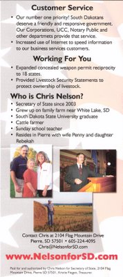 For both front and back, the content is good, although I'd like to see more on Chris' background. But when you've got limited space, you have to choose between content and type size.
The text is bold and easy to read without being too voluminous. I would have centered "Who is Chris Nelson?" to match the other two headings, or offset it with a dividing line between it and the section above it.
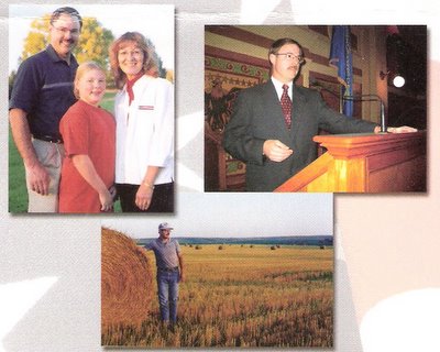 I like the pictures here moreso than the one on the front - that farm one would have made a nice shot that I might have used on the front instead. Lots of color and contrast, and it's an atypical photo. Otherwise, the one in the legislative chambers illustrates a South Dakota quirk. The lighting in the legislative chambers is horrendous and you can hardly do anything about it.
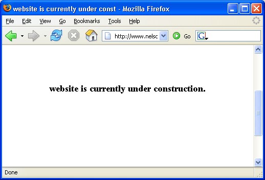
The only thing I would say is a flaw is the fact that www.nelsonforsd.com is not active yet. The first thing I did when I saw the card and the web address was to try to go to it. And what did I get?
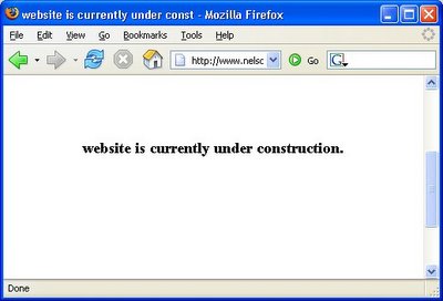
For you candidates, if you are listing a website on your materials, and the website is not going to be up for a while, see if you can at least get a logo up as a placeholder for the time being.
SO, what's today's grade for SDWC Campaign Lit 101?
In all of this, it's simply my own opinion and nothing more. It's not meant to pick on anyone. I might just point out what I'd do differently. Don't agree? That's your right. Last election I disliked Dusty Johnson's choice of orange as a campaign color. He ignored me, and rode the orange wave to victory, since it stood out from the pack. What can I say? I'm a traditionalist, so I tend to look at things in those terms.
Anyway, the first piece of campaign literature up for 2006 up for review? Secretary of State Chris Nelson.
 This is an exceptionally good looking piece of campaign literature. I like the colors. Plus full color 2 sided slick paper - this was not cheap, nor is it "insty-print" quality. The design is also attractive. I'd imitate this campaign card in a second.
On the front, if it had anything I would call a deficiency, my personal preference would be to have the name and office stand out more, and Vote to stand out less. At the very least, name and office could have been in red as well. But then again, I might have looked at it the other way and left it like this.
I might have also preferred a picture with a dark suit for that background, but absent that, it does draw the focus on his face, which may have been in the intent.
 For both front and back, the content is good, although I'd like to see more on Chris' background. But when you've got limited space, you have to choose between content and type size.
The text is bold and easy to read without being too voluminous. I would have centered "Who is Chris Nelson?" to match the other two headings, or offset it with a dividing line between it and the section above it.
 I like the pictures here moreso than the one on the front - that farm one would have made a nice shot that I might have used on the front instead. Lots of color and contrast, and it's an atypical photo. Otherwise, the one in the legislative chambers illustrates a South Dakota quirk. The lighting in the legislative chambers is horrendous and you can hardly do anything about it.
The only thing I would say is a flaw is the fact that www.nelsonforsd.com is not active yet. The first thing I did when I saw the card and the web address was to try to go to it. And what did I get?
For you candidates, if you are listing a website on your materials, and the website is not going to be up for a while, see if you can at least get a logo up as a placeholder for the time being.
SO, what's today's grade for SDWC Campaign Lit 101?
| Material Quality | A+ |
| Design | A |
| Content | B |
| Photography | B+ |
| Overall Grade | A- |
It's not what I'd consider perfect, but it's pretty darn close. It's the kind of quality that you would expect coming out of a congressional or senatorial campaign - and that's good. It only needs a tweak here and there, and it would be A+ in my book.
Comments