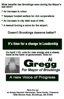
It's good to see that one of the guys from ZZ Top is going into politics
Every girl might be crazy about her Sharp Dressed Man, but she'll have no idea why she's voting when she looks at this ad. What in the heck is this political ad trying to accomplish?
 Ugh. I hate local political campaign ads because they are usually horrible. No focus on name and office and all sorts of goofiness. This one is a prime example of a campaign ad costing you money but not doing a thing for the candidate.
I actually met Al Gregg back when I was in college as a student working for the SDSU University police. I was towing cars, and I believe he was the towing company. I found him to be a pretty darn nice guy - a hard worker/self-made man/salt of the earth type. He's originally from Pierre, and has had a business in Brookings for YEARS.
Al has several 3 color 4x4 coroplast signs at strategic locations around Brookings, and I've been looking at his sign up the street from me at the corner by the Jr. High for weeks now. But that being said, his 4x4 effort isn't being complemented with anything else.
This picture of him (yes, he's the one with the beard) shaking a guy's hand doesn't do anything for me. And the ad not only does a poor job of communicating name and office (the two biggies) it almost offends me because it's an overt public demand for money without giving me a reason why I should vote for him.
The ad comes off as an ad for the campaign treasurer as much as it is for Al himself. Unless he's a local notable, who gives a crap who his manager/treasurer is.
So, how would I fix this train wreck of a political ad? What would I emphasize and de-emphasize? What would I do differently? (Consider this another edition of my extreme campaign material makeover).
Here's my 10 minute re-engineering of this political ad:
 First off, when you're campaigning on "Time for a change" you need to express what you are changing from. Change for it's own sake is a bad theme in politics. People want to change only when things are bad. If it's good, and you have a message of change, it doesn't resonate very well. So remind them why things are bad, and then speak to their hopes for a better future. (I'd also like to note that I HAVE NOT RESEARCHED THE ISSUES IN THE AD. THEY ARE FOR ILLUSTRATIVE PURPOSES ONLY.)
Now that we've illustrated the bad, tell them that you'd fix it. It might even be adviseable to tell them how you'd fix it, but a small 2 column by 6 inch ad is a bad place for lots of text when you need most of it for name and office.
Speaking of that, the next thing I've done is emphasized the name and the office, and minimized that terrible picture which didn't say a thing about why the candidate was the better choice. It looks more like someone is shaking hands with Santa then a candidate photo. In all honesty, you could probably do the ad without a picture, period. Because they aren't voting for the picture, they're voting for name id, and vague concepts that they associating with the candidate on election day.
Finally, I've made the disclosure big and bold, so they know where they can send a check if they want to. It serves the same purpose, and it's not so crass as telling them to send in a newspaper ad. That should be done with private, behind the scenes fundraising appeals, anyway.
It looks better already.
I haven't decided myself who I'm voting for on April 11th (via absentee ballot), but I'll be sure to watch the political ads in the Brookings Register and the Brookings yellow shopper paper as I make up my mind.
 Ugh. I hate local political campaign ads because they are usually horrible. No focus on name and office and all sorts of goofiness. This one is a prime example of a campaign ad costing you money but not doing a thing for the candidate.
I actually met Al Gregg back when I was in college as a student working for the SDSU University police. I was towing cars, and I believe he was the towing company. I found him to be a pretty darn nice guy - a hard worker/self-made man/salt of the earth type. He's originally from Pierre, and has had a business in Brookings for YEARS.
Al has several 3 color 4x4 coroplast signs at strategic locations around Brookings, and I've been looking at his sign up the street from me at the corner by the Jr. High for weeks now. But that being said, his 4x4 effort isn't being complemented with anything else.
This picture of him (yes, he's the one with the beard) shaking a guy's hand doesn't do anything for me. And the ad not only does a poor job of communicating name and office (the two biggies) it almost offends me because it's an overt public demand for money without giving me a reason why I should vote for him.
The ad comes off as an ad for the campaign treasurer as much as it is for Al himself. Unless he's a local notable, who gives a crap who his manager/treasurer is.
So, how would I fix this train wreck of a political ad? What would I emphasize and de-emphasize? What would I do differently? (Consider this another edition of my extreme campaign material makeover).
Here's my 10 minute re-engineering of this political ad:
 First off, when you're campaigning on "Time for a change" you need to express what you are changing from. Change for it's own sake is a bad theme in politics. People want to change only when things are bad. If it's good, and you have a message of change, it doesn't resonate very well. So remind them why things are bad, and then speak to their hopes for a better future. (I'd also like to note that I HAVE NOT RESEARCHED THE ISSUES IN THE AD. THEY ARE FOR ILLUSTRATIVE PURPOSES ONLY.)
Now that we've illustrated the bad, tell them that you'd fix it. It might even be adviseable to tell them how you'd fix it, but a small 2 column by 6 inch ad is a bad place for lots of text when you need most of it for name and office.
Speaking of that, the next thing I've done is emphasized the name and the office, and minimized that terrible picture which didn't say a thing about why the candidate was the better choice. It looks more like someone is shaking hands with Santa then a candidate photo. In all honesty, you could probably do the ad without a picture, period. Because they aren't voting for the picture, they're voting for name id, and vague concepts that they associating with the candidate on election day.
Finally, I've made the disclosure big and bold, so they know where they can send a check if they want to. It serves the same purpose, and it's not so crass as telling them to send in a newspaper ad. That should be done with private, behind the scenes fundraising appeals, anyway.
It looks better already.
I haven't decided myself who I'm voting for on April 11th (via absentee ballot), but I'll be sure to watch the political ads in the Brookings Register and the Brookings yellow shopper paper as I make up my mind.
Comments