Just another couple examples
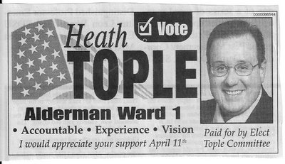
Good Advertising - Bold name and office. and only a few bulleted points. As an added bonus, he'd appreciate your support. I don't have to think, I just have to read it in 15 seconds, and I have it.

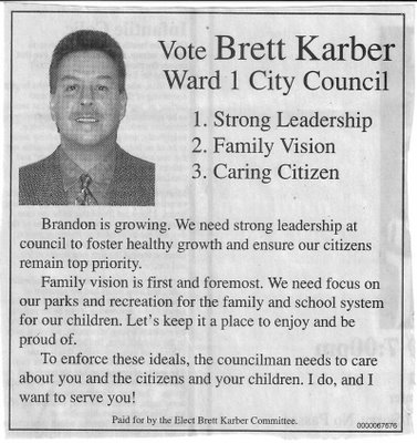
Not so good - Name and office only stand out so-so. He has bullets, but I'm wondering if I can take my kids in for Family Vision care. And then there's these long rambling paragraphs. Too much for such a small ad.

Keep it short and sweet, and put your emphasis on those things you want the voting public to remember - Name and Office!

Not so good - Name and office only stand out so-so. He has bullets, but I'm wondering if I can take my kids in for Family Vision care. And then there's these long rambling paragraphs. Too much for such a small ad.

Keep it short and sweet, and put your emphasis on those things you want the voting public to remember - Name and Office!
Comments