Political signs I saw on my trip back to Pierre.
I thought I'd do something a little more personal and share with you the images I drive by every weekend as I go back and forth between Pierre and Brookings. Since I care about literally nothing but politics, here's my travelogue in political signs.
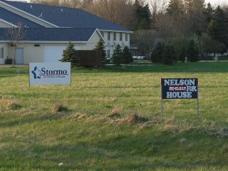
As far as political signs go along the route, the part of Legislative District 6 that Highway 14 cuts through has been the only one with signs as of yet. Samantha Stormo has led the pack for a few weeks now, and I've noticed that she has the best coverage so far. I see her signs starting between Iriquois and Cavour, all the way to Brookings. But as you see below, Paul Nelson has now entered the political sign fray. Here he has his sign by Samantha's in Desmet:
And here's his sign that sits outside of Arlington:
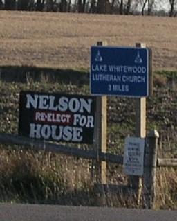 To his credit, Paul has decent coverage. If only his signs didn't look like a train wreck. It's like they said Nelson for House, and he wanted to add re-elect. Except now FOR was covered, and they had to add it. They should have just left it the old way.
They weren't there on the way over, but as I rolled through DeSmet this evening, I saw that a flock of Greenfield signs had gone up. In fact, I called Brock on the phone as I rolled though DeSmet, and he happened to be on the North side of DeSmet putting up signs. He had pretty good coverage on either side of town.
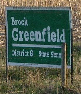
And useless trivia buffs, here's one for you - these are the same signs Brock used 6 years ago and every election since. They were my first attempt at making a template, and they still look great.
On this next one, I don't want to be too harsh. But seeing a sign like this really tests my limits for tolerance.
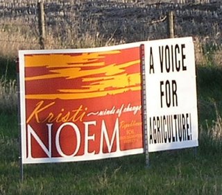 Here's a coroplast sign that I snapped as I approached DeSmet. It looks like it could be a combination of screenprinting and vinyl or just plain vinyl. Aside from looking like it's in the highway right-of-way, I'm guessing the cost for this sign to be about $100-150.
As a still picture, I can't tell what she's running for. And at 65 mph, it doesn't get any easier. And what is that logo. A friend of mine was going to use one just like it for a run at statewide office. Sunset and windmill, and I just gave him the business over it. Name and Office - you can never go wrong.
But that might all be based on my personal prejudice on using Burnt Umber and Orange. They just don't do it for me on campaign colors. (and yes Dusty, you were right and I was wrong. But I still hate orange as a campaign color)
As I came to this sign by DeSmet as I traveled West, the only other candidate to have any up in my route was Dennis Wiese, running in the Democratic Primary for Governor.
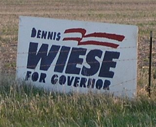 And I'd swear to god that it looks like it was manufactured by using the same process as I've described on this blog. (Somebody must be paying attention).
As far as political signs go along the route, the part of Legislative District 6 that Highway 14 cuts through has been the only one with signs as of yet. Samantha Stormo has led the pack for a few weeks now, and I've noticed that she has the best coverage so far. I see her signs starting between Iriquois and Cavour, all the way to Brookings. But as you see below, Paul Nelson has now entered the political sign fray. Here he has his sign by Samantha's in Desmet:

And here's his sign that sits outside of Arlington:
 To his credit, Paul has decent coverage. If only his signs didn't look like a train wreck. It's like they said Nelson for House, and he wanted to add re-elect. Except now FOR was covered, and they had to add it. They should have just left it the old way.
They weren't there on the way over, but as I rolled through DeSmet this evening, I saw that a flock of Greenfield signs had gone up. In fact, I called Brock on the phone as I rolled though DeSmet, and he happened to be on the North side of DeSmet putting up signs. He had pretty good coverage on either side of town.

And useless trivia buffs, here's one for you - these are the same signs Brock used 6 years ago and every election since. They were my first attempt at making a template, and they still look great.
On this next one, I don't want to be too harsh. But seeing a sign like this really tests my limits for tolerance.
 Here's a coroplast sign that I snapped as I approached DeSmet. It looks like it could be a combination of screenprinting and vinyl or just plain vinyl. Aside from looking like it's in the highway right-of-way, I'm guessing the cost for this sign to be about $100-150.
 As a still picture, I can't tell what she's running for. And at 65 mph, it doesn't get any easier. And what is that logo. A friend of mine was going to use one just like it for a run at statewide office. Sunset and windmill, and I just gave him the business over it. Name and Office - you can never go wrong.
But that might all be based on my personal prejudice on using Burnt Umber and Orange. They just don't do it for me on campaign colors. (and yes Dusty, you were right and I was wrong. But I still hate orange as a campaign color)
As I came to this sign by DeSmet as I traveled West, the only other candidate to have any up in my route was Dennis Wiese, running in the Democratic Primary for Governor.
 And I'd swear to god that it looks like it was manufactured by using the same process as I've described on this blog. (Somebody must be paying attention).
Comments
Which explains why PP doesn't care about the fact that we put people in prison for trying to feel better.
What process are you talking about?
And Anon 4:56, I'd take the Stormo sign as graphically pleasing and distinct anyday over some of the other signs. What's your beef with Samantha anyway?
Apologies for being long winded.
We like what we know.
And Anon 5:13 - if you're saying "my ideas" as I refer to a system of how to make a sign template - yes, I'm serious.
I, along with State Auditor Rich Sattagst, over the course of the past 6 years figured out a way to make 4x8 highway signs that look almost as good as if they were screenprinted.
In fact, it's one reason I taught myself screenprinting - and built my own equipment. Because I wanted to take it to the next level of quality.
And recently, I shared much of what we figured out. Of course, I didn't share EVERYTHING. But enough so candidates I wasn't assisting would be able to do enough of it themselves.
My point was that it looked like Wiese adopted some of the techniques I described on the blog, which I consider good practices.
God knows I didn't originate the South Dakota 4x8, but Rich and I have refined it greatly.
So, nyeah.
Anon 9:41, aside from sounding like someone who's team is running scared, do you want me to point out statistics on how often younger Republicans win against older candidates?
Last time I sat and seriously figured it out, it was about 80%
And what is she running for?
#1 - I don't like Brown and Orange as campaign colors. And I like them together even less. Some people agree, some don't.
#2 - From the sign in question, you cannot tell what office this is for. Especially at 65mph. I know because I drive by it 2 times a week (4 this week).
#3 - I have lots of people's pictures on my weblog. Stephanie Herseth, Frank Kloucek, and Stan Adelstein (as portrayed by Eric Cartman). Are you saying that I'm staunch supporters of theirs? (I wouldn't consider "a" picture, plastering.
And #4, So what? It's my party and I'll write what I want to. (Write what I want to, write what I want to). A blog by definition is journal of personal thoughts and opinion.
and lastly, If I don't care for something, I typically explain why under my name (not anonymous). If I choose to "rip apart" somebody, I'm going to do it based on their views, statements, or actions. (see Stan Adelstein, or Jim Holbeck for examples). Saying "I don't care for that" is not ripping apart.
I do it for fun and entertainment, and because I am passionate on behalf of people I support.
Don't like it? Start your own blog. I'm going to write mine as I see fit.
so, nyeah.
In 2002 GOP candidates, including a race I was involved in, paid $35 per side for 2 color 4x8's. My campaign did one sided, Thune did 2-sided. And they were consistently about $35 per side. And that was buying in bulk of 200+ signs at a time.
I'm counting 3, possibly 4 colors, which means art and screen charges for that many individual 4x8 foot stencils.
Maybe I'm making a false assumption and prices have gone through the floor, but I have my doubts that you can purchase signs like that in South Dakota for $33.
Ms. Congeniality is not given in this race.
That, and what is "Winds of Change?" It sounds like a fart joke.