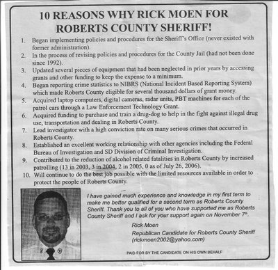
More campaign advertising: 10 reasons why Rick Moen, but 5 reasons why his advertising needs a makeover.
I saw this ad in one of the newspapers, and it's a perfect example of local candidates doing their own ads. And instead of 10 reasons why- here's 5 reasons why it just doesn't work.
 I'm not saying the entire ad is bad. It's just that it could be so much better with a little tweaking. If I was going into helping someone with a brochure or ads, I might ask them for 10 points and this would be perfect as a starting point. But not for a finished product. I'd use a few of the points that stood out to begin crafting. Meaning, start from 10, and then trim from there.
But here, problem #1 - I think it's too much for a newspaper ad. It's too much text at once for people to consistently take away one or two, or even three reasons to vote for him. You need to build a few short memorable themes and then beat them into people's heads over, and over, and over.
It's like the ad campaign we ran against the reorganization in Pierre. We picked three basic themes, and hammered them, and hammered them, and hammered them. We were outspent at a minimum of 5 to 1, but the opposition's message was poorly crafted, and all over the place. They ran 2 color double newspaper spreads while I mimeographed flyers at home. Yes, they won, but 27 votes wasn't much of a victory. In hindsight, another $300 for a mailing would have tipped it our way. (and I told my guys how much I needed to win it.)
Similarly, in a much higher profile race, I'd identify that as the same problem I think Stan Adelstein had in the primary - he had so many different ads saying so many different things. Instead of reinforcing a theme, I'd argue it lent itself to confusion. Spending $100k in advertising doesn't mean that you buy 100k worth of different messages. Use more varied advertising mediums to reinforce the message if you have more money.
Problem #2 - "10 reasons why Rick Moen for Roberts County Sheriff!" That's supposed to be the headline theme. But what is it saying? Why what? It's a display ad, so they're not charging by the word. Use a grammatically correct sentence.
But even if it was grammatically correct, it does something I've always been told not to do, and I tell candidates to avoid that trap as well - Don't make a statement of an election a question. Make it a declaration. If you ask someone why, they might just respond by answering "Beats me. Why would I vote for him?"
I think the candidate could have better been served by something such as "Rick Moen - A Solid Record of Service for Roberts County" or even more simply, "Re-Elect Rick Moen for Roberts County Sheriff" and then let the bullets speak for themselves.
Speaking of bulleted points, Problem #3 - relating back to point #1 - there's too much text for each bullet. "Updated several pieces of equipment that had been neglected in prior years by accessing grants and other funding to keep expenses to a minimum." That's a mouthful, and no one can recite that. I would have written it as "Updated equipment at no cost to the county taxpayers." Short and sweet is what you need to consider for bullet points.
Problem #4 - it's not bad, but I see the possibility that he's falling into the trap of getting too technical in the ad. It talks about the NIBRS, and PBT's, and talks about the reduction of alcohol related deaths and lists the statistics year by year.
Remember your medium. It's a newspaper ad. Keep it simple. For a brochure, you may be able to get away with it on the off chance you might have room to explain it. A website is better yet for such things. But for a newspaper ad, the answer is NO.
And Problem #5 - PAID FOR BY THE CANDIDATE ON HIS OWN BEHALF. No one else supports him? Grrr.... I hate this all too common disclaimer because it tells voters you are out there on your own and intimates no community push behind the effort. Form a committee, and get a treasurer. Even if you don't have a groundswell of support, at least put the illusion out there that you might.
Other things?
It goes to personal preference, but I would have restated the name and office by the picture. Name and office are the two most important parts of candidate advertising, with many political races won and lost on name ID alone. So put the name and office out there as much as possible.
And I'd also point out that the statement at the bottom with his personal quote would have made a decent ad by itself with the name and office. More than decent, it was a well expressed personal thought thanking the voters and requesting their continued support. So why clutter it up with all that other text that most people are not going to take any consistent themes away from?
So - with all that said - those are my thoughts on campaign advertising tonight. And good luck to Rick.
Believe it or not, I do support my Republican candidates.
Comments