A few newspaper ads from a few of the big races
I started chuckling when I saw this one.
Tom, they do have surgery to help remove unwanted growths. You might get it checked before it turns cancerous on your party.
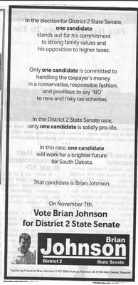 This ad from Brian Johnson is issue oriented and in a bulleted form points out a few things that his opponent isn't - pro-life, and standing for family values. Along with that, it takes a shot at Hundstad's record on tax measures (which I can assume means the intangible income tax and Amendment D).
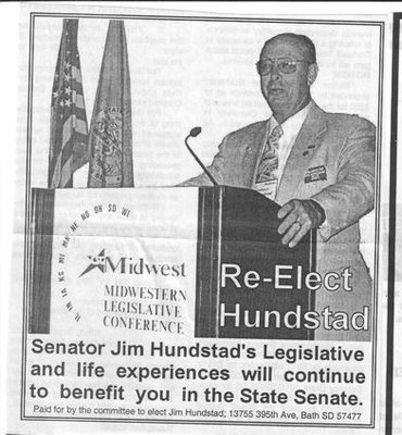 Hundstad moved away from the utter "dorkiness" of riding a sedgeway into this ad which has his name and refers to his office (and not much more). Less dorky, but it still doesn't "pop" on the page.
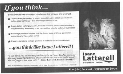 I like this ad from Isaac Latterell with it's bulleted points and repetition of his name. The only thing I would change is the background in the photo - that's the downside of doing your setup in color. It's hard to see how it will turn out when it's printed.
I've fallen victim to it myself a few years back, and I learned my lesson. As you can see with this black and white Larry Long ad, the newspaper people aren't necessarily going to fix it for you.
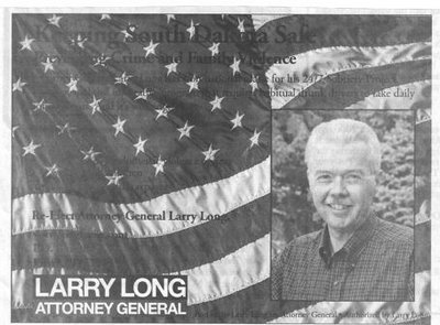 I saw it this way in 2 papers, and in all the rest, they corrected for it or left out the background entirely. I'm sure this is a super-sharp ad in full color, but any black text on a red background will end up black-on-black when it goes to newsprint.
Stay tuned! More to come.
Tom, they do have surgery to help remove unwanted growths. You might get it checked before it turns cancerous on your party.
 This ad from Brian Johnson is issue oriented and in a bulleted form points out a few things that his opponent isn't - pro-life, and standing for family values. Along with that, it takes a shot at Hundstad's record on tax measures (which I can assume means the intangible income tax and Amendment D).
 Hundstad moved away from the utter "dorkiness" of riding a sedgeway into this ad which has his name and refers to his office (and not much more). Less dorky, but it still doesn't "pop" on the page.
 I like this ad from Isaac Latterell with it's bulleted points and repetition of his name. The only thing I would change is the background in the photo - that's the downside of doing your setup in color. It's hard to see how it will turn out when it's printed.
I've fallen victim to it myself a few years back, and I learned my lesson. As you can see with this black and white Larry Long ad, the newspaper people aren't necessarily going to fix it for you.
 I saw it this way in 2 papers, and in all the rest, they corrected for it or left out the background entirely. I'm sure this is a super-sharp ad in full color, but any black text on a red background will end up black-on-black when it goes to newsprint.
Stay tuned! More to come.

Comments
Mark Foley
M.F.
-ps, if this was a Brock shot we would think it likely to be some sausage product.
[Stan adelstien barely moving his lips and making strange voice] "Hi, I'm Tom Katus. I'd love it if you'd meet me and my master--er, stan--for coffee at marcdonilds!"
It's nice to know that conservatives can be funny though. Or was the humor coming from the liberals?
I'm not saying it hasn't happened, but I'm also not saying he isn't playing with his photo editor again.
Regardless, why would they ever give him the microphone?
He's a card, but then again, how many games actually include the joker?
Then, Laterell and Hoerth took the stage. Double wow! Laterell showed that he is more than prepared to serve the people of this area. He is undoubtedly the more thoughtful and intelligent of the two.
I was most impressed at the ability of both of these fine young men. They are wise beyond their years.