It's time for a makeover.
An EXTREME brochure makeover!
(With apologies to my favorite show on ABC)

I was perusing the Internet the other day, and pulled up the stop2006.org website - the effort being pushed by Senator Bill Napoli to stabilize property assesments. And on the website, they had a .pdf image of the brochure that they must apparently be using. I looked at it, and I had mixed emotions in reading what was there to support their position.
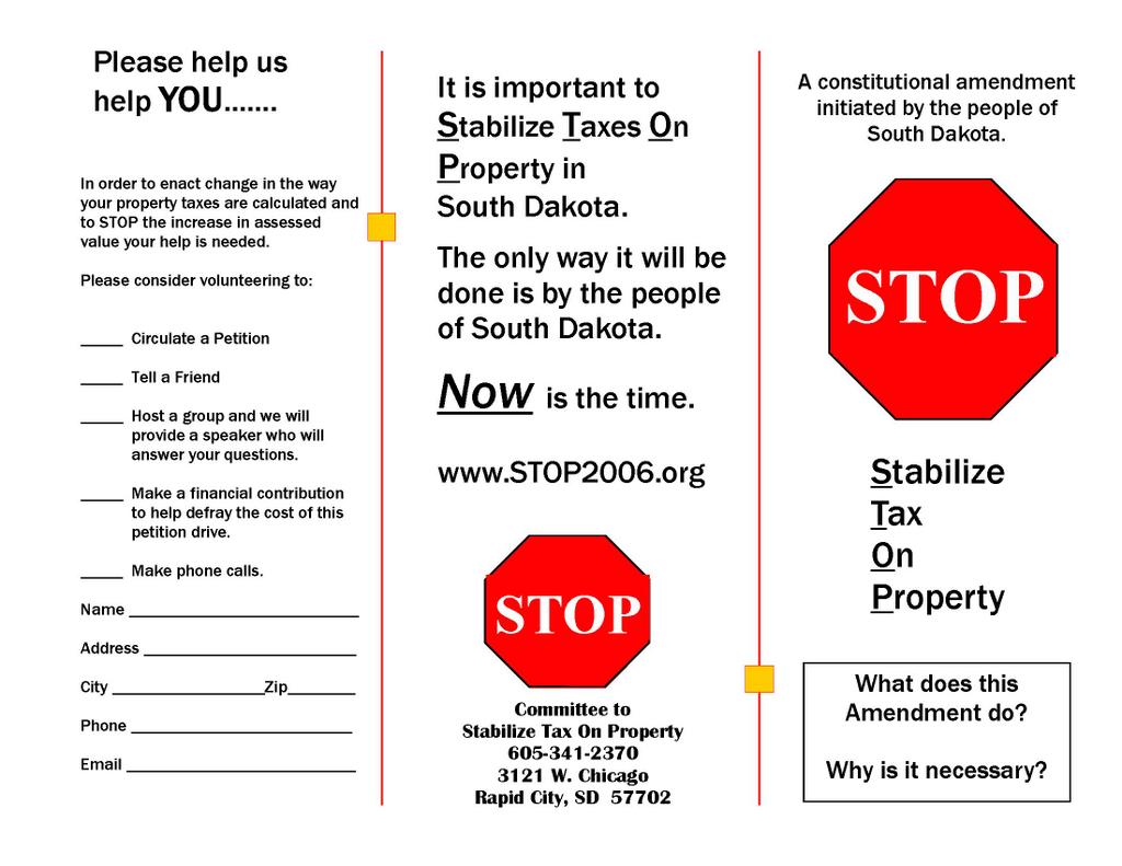 It's not that it's bad. It took someone a good hour or so using Microsoft Publisher. But, I wouldn't give it a ringing endorsement as 'good' either. Actually, it's a little confusing.
The STOP is very easy to remember - but, used in this case, the S.T.O.P. along next to the stop sign seems a bit of a double negative. Without knowing it's source, you might ask - are we supposed to stop the petition? Are we supposed to vote for it? I DON'T KNOW! I'm so confused!
And once again, another example of not paying attention to detail. They forgot the disclaimer.
Not to nitpick, but I can find all sorts of things wrong with it. The volunteer panel doesn't have a preaddressed panel on the back. They actually have to physically tear it off and put it in an envelope, and address the envelope. That's going to automatically cut down on responses.
Where does the brochure technically lay out the problem, and say why this is the best solution? A BS artist like me can see the rhetoric, but I don't see a simple explanation. This is not a good thing, considering they have done a decent job to date of explaing their position. Why muck it up with bad advertising?
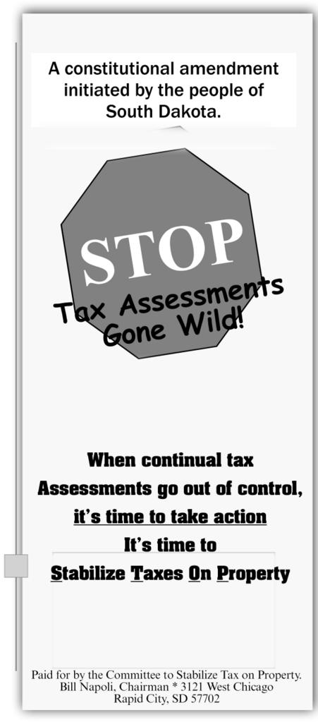 Okay - I took about a whole 5 minutes to do this, with a Michelob in my hand. (I'm hot & sweaty after vacuuming tonight, ok?). It's clear what we are trying to stop now, isn't it?
I tilted the sign, just so it isn't so stark on the page. And I added a box with a drop shadow just to offset it, and make it stand out. Now, the opening page on the brochure provides a brief introductory explanation which can be expounded on inside. (And now it has a blankety blank disclaimer on it! )
In my time, I've nailed a democrat or two in front of big audiences before about not following campaign finance disclosure laws. Actually, it's a pretty easy mistake to make. So why take a hit for it?
I'm not going to do the rest of the brochure for them, but you get the point. It should be easy to read. It should say why we need it and what will happen if we don't do it. The informational page's back should be a pre-addressed tear off panel, and it needs to be more visually appealing.
I'll be the first to admit - I'm not the greatest at this stuff. I know people who quickly put me to shame in the graphic design department. But when I need something done myself for free - I can make a passable brochure that is easily understood and gets the message across.
Keep brochures simple, and with as little text as needed and make them visually appealing. Need a further explanation? Divert them to a website. Only give them as much information as they can digest in 2-3 minutes. Because if you're lucky - that's the longest they are going to look at it before they throw it away.
Comments
1) Don't offer specific political advice before cashing client's check
2) Choose your clients carefully
Nice work on your little graphic, by the way......