Well, it looked good on the computer.
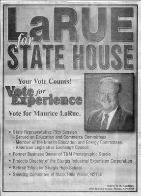
 During the primary, I saw this ad, and thought to myself "I've been there and it's happened to me."
What am I referring to? Ads destined for newsprint which look nice on the computer screen, but end up with muddy tones of grey in the final outcome.
I've been using tabloids for years, designing most all of them by scratch; hammering out text by myself or with a writing partner. 9 out of 10 end up looking great. And then I had one destined to be used statewide.
It had a great flag graphic half-toned in the background for the cover. On the computer it looked crisp and sharp and very attractive. And after it printed, my initial reaction was "what happened?"
My crisp greyscale flag graphic was a muddy washed out mess. It looked more like the 1950's era Blob than a prod icon of American symbolism and patriotism.
Maurice has similar problems here. His picture which probably looked great on the computer screen actually is too close of a blend with its background. And for the ad itself, the grey background actually makes his name stand out less than if it were a white background - it subdues the effect of all the lettering and makes them harder to read.
How could he have made this better? By dumping all the grey background, and making his head and shoulders shot a cut-out. The ad follows many of the rules I like about boldness, size, and highlighting name and office. He's bulleting his points, and they're not overly verbose (as I have a tendency to be). But then it's muddled and subdued.
I'm sure it looked as sharp as can be on the computer, but then real-life application intervened. And newsprint just isn't forgiving on clarity. In fact, it's the enemy of a high resolution advertisement.
On the one I did, we switched design in a later tab, and won the race in spite of that flub. But it taught me a lesson I repeat to this day - white space is king, especially in newsprint advertising.
Comments